RBT® Training Options
✅ 87.2% first-time pass rate on the RBT® board examination!
💬 AI-powered practice support!
In Applied Behavior Analysis, data helps tell the story of progress. But numbers alone can be hard to understand. That is why ABA professionals use data displays, such as line graphs and bar graphs, to organize information and make behavior change easier to see.
In Chapter 16 of the ATCC 2026 RBT® Training, 3rd Edition, students learn how common data displays help RBTs and BCBA supervisors track progress, identify trends, and make data-based decisions. This lesson focuses on two important graph types used in ABA: line graphs and bar graphs.
Why Data Displays Matter in ABA
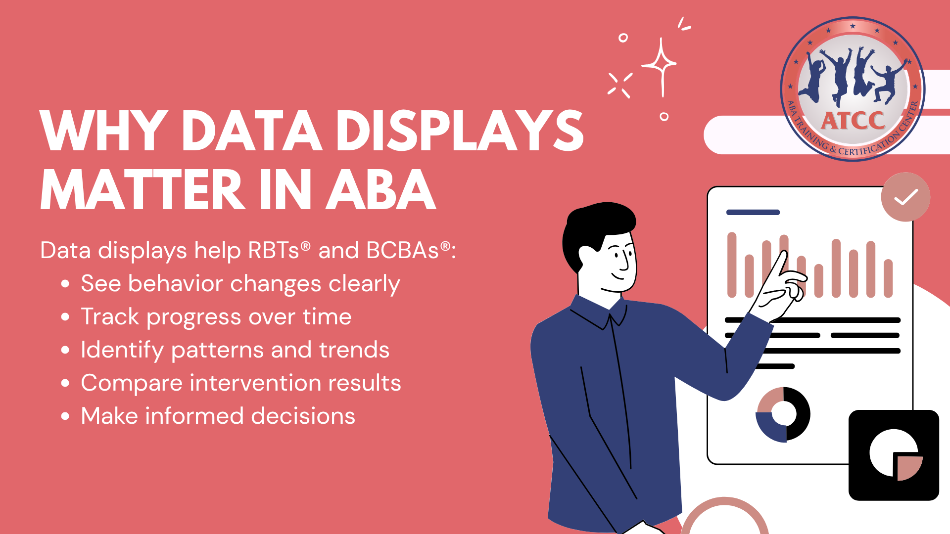
Data displays are important because they help RBTs and BCBAs understand behavior changes more clearly. Instead of only looking at raw numbers, graphs allow the team to see patterns, progress, and changes over time.
Data displays can help show:
Progress over time
Increases or decreases in behavior
Patterns or trends
Differences across conditions
Whether an intervention may be helping
For RBTs, understanding data displays is important because the data they collect often becomes part of a graph reviewed by the BCBA.
Line Graphs: Tracking Behavior Over Time
A line graph shows how behavior changes across time.
In ABA, line graphs are commonly used to track data across sessions, days, or weeks.
A line graph usually includes:
An X-axis that shows time, dates, or sessions
A Y-axis that shows the behavior being measured
Data points connected by a line
A clear title and labels
Line graphs are helpful because they show trends. A line graph can show whether behavior is increasing, decreasing, staying the same, or changing inconsistently.
For RBTs, the main idea is simple:
Line graphs help show behavior change over time.
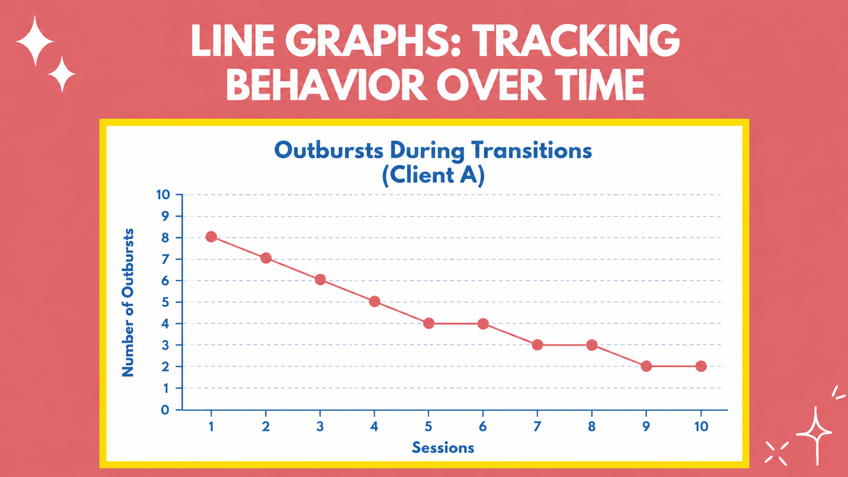
Below is an example of a line graph:
Bar Graphs: Comparing Data Across Categories
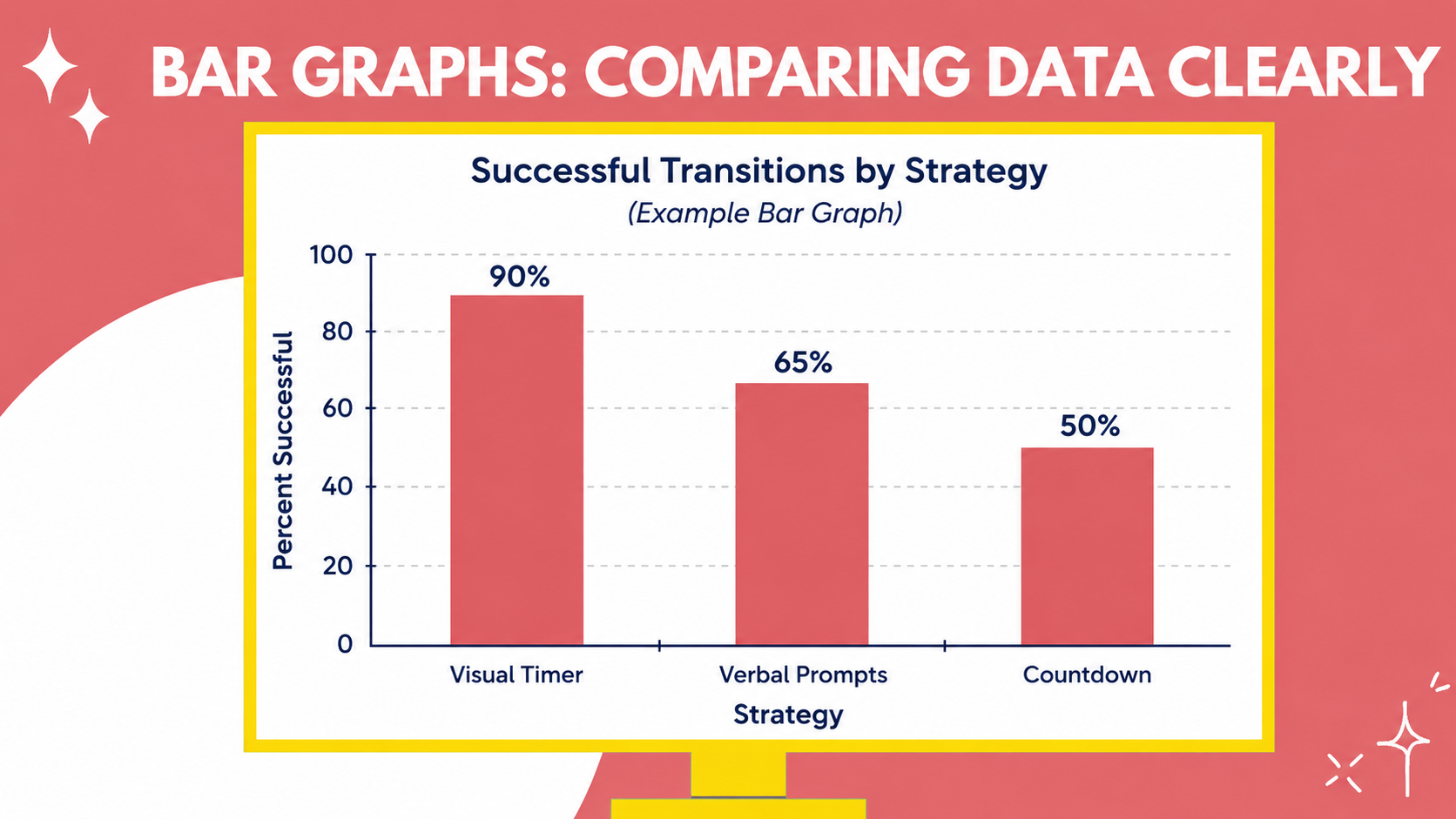
A bar graph is used to compare data across categories, conditions, or strategies. Each bar represents a value, such as a frequency, percentage, or total number.
A bar graph usually includes:
An X-axis that shows the categories being compared
A Y-axis that shows the data valueBars that represent each category
A clear title and labels
Bar graphs are useful when ABA professionals want to compare outcomes. They can help show which condition, strategy, or category has a higher or lower value.
For RBTs, the key idea is:
Bar graphs help compare data clearly.
Below is an example of a bar graph:
How Graphs Help RBTs Support Better Decisions
RBTs do not make major treatment decisions alone, but they play an important role in collecting accurate data. That data helps the BCBA evaluate progress and decide what changes may be needed.
Graphs help turn everyday data into meaningful information. They allow RBTs, BCBAs, caregivers, and team members to see the same picture clearly.
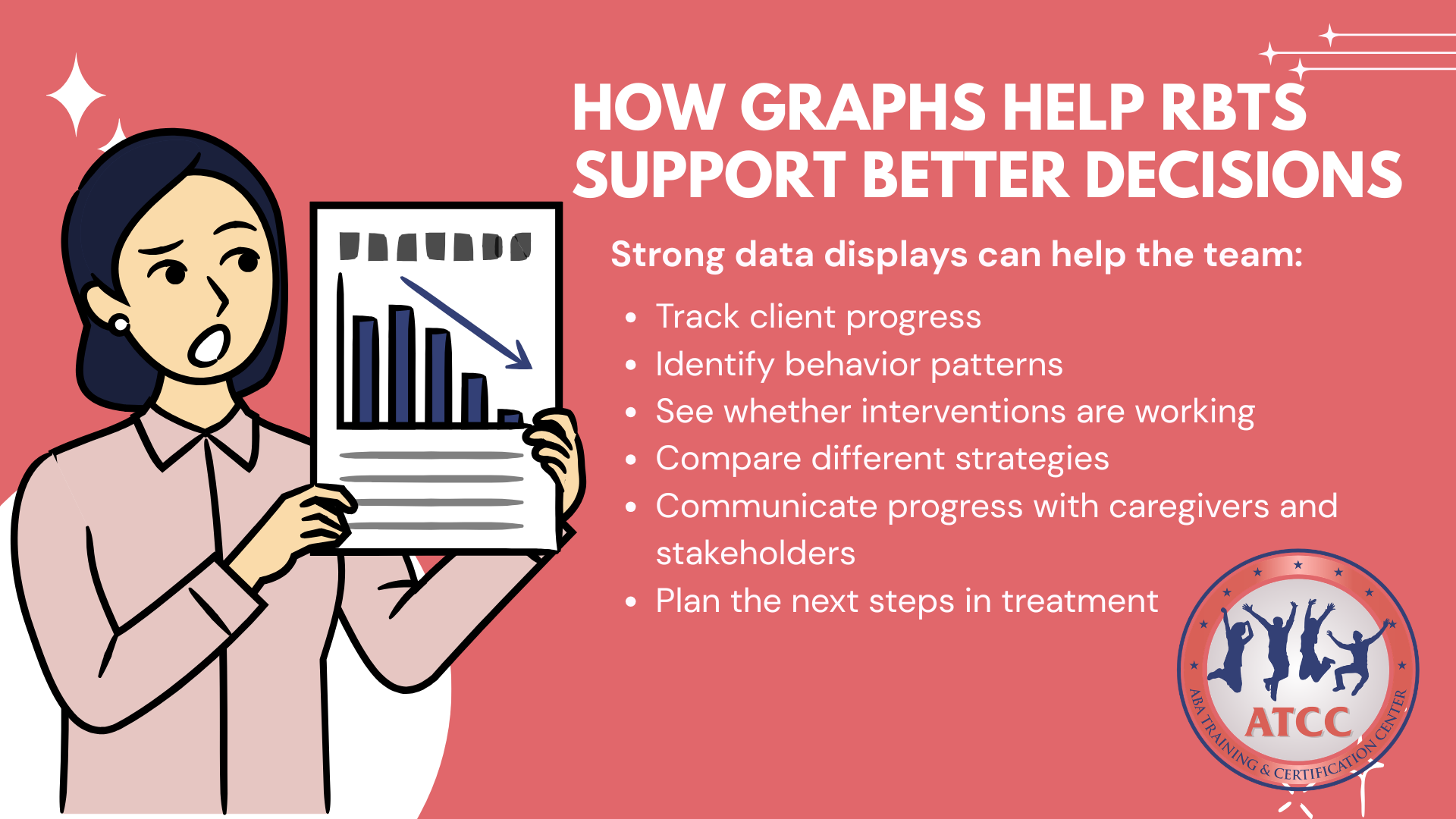
Strong data displays can help the team:
Track client progress
Identify behavior patterns
See whether interventions are working
Compare different strategies
Communicate progress with caregivers and stakeholders
Plan the next steps in treatment
In ABA, good data supports better decisions. When RBTs understand how graphs work, they become stronger members of the treatment team.
Ready to start your RBT journey?
Keep Learning with ATCC®
At ABA Training & Certification Center (ATCC), our goal is to make RBT training easier to understand, supportive, and connected to real-world ABA practice.